Is Civ 7's UI as Bad as They Say?
Is Civilization VII's UI as Bad as Advertised? A Critical Assessment

The recent release of Civilization VII's Deluxe Edition has sparked considerable online debate, particularly concerning its user interface (UI). Is the criticism justified, or is the outcry overblown? This analysis dissects the UI, comparing it to established best practices for 4X game interfaces.
← Return to Sid Meier's Civilization VII main article
Assessing Civ 7's UI
Within a day of its release, Civ VII faced criticism, primarily targeting its UI and missing quality-of-life features. While it's easy to join the chorus of disapproval, a balanced assessment is needed. We'll examine its components to determine if it truly falls short of expectations for a 4X game interface.
Defining a Superior 4X UI
While some believe objective standards define a good 4X UI, the reality is more complex. A UI's effectiveness depends on the game's context, style, and goals. However, established principles of visual design offer common elements found in successful 4X UIs. Let's evaluate Civ VII against these key aspects:
Information Hierarchy
A clear information hierarchy prioritizes accessibility and relevance. Essential resources and mechanics should be prominent, while less crucial features remain easily accessible. The UI shouldn't display everything at once, but information should be logically organized. Against the Storm's building menus serve as a positive example.
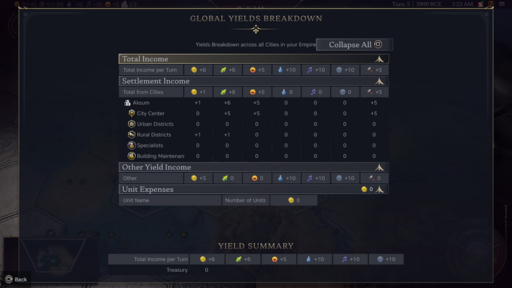
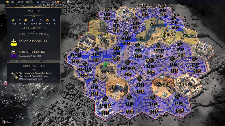
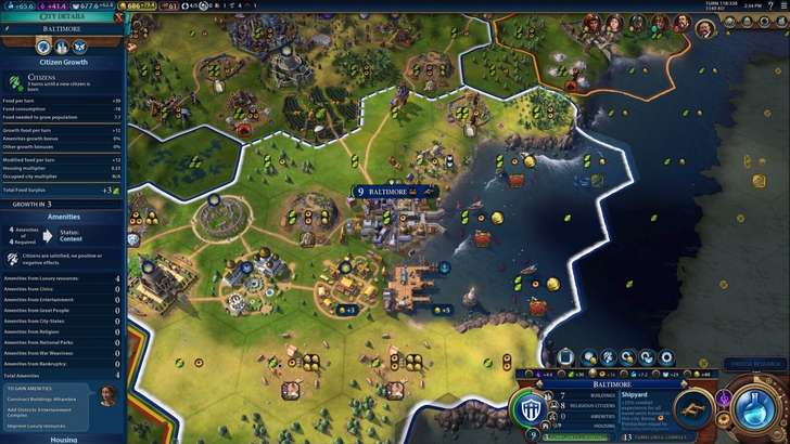
Civ VII's resource summary menu displays resource allocation, separating income, yields, and expenses. The tabular format aids tracking, with detailed breakdowns available. However, it lacks specificity; precise district or hex-level resource generation isn't shown, and expense breakdowns are incomplete. While functional, greater detail would improve it.
Visual Indicators
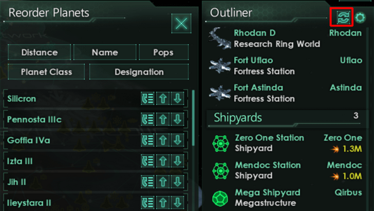
Effective visual indicators (icons, colors, overlays) convey information quickly. Stellaris' Outliner, despite the game's cluttered UI, excels here.
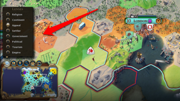
Civ VII uses iconography and numerical data for resources. Tile yield overlays, settlement overlays, and settlement expansion screens are effective. The absence of certain lenses from Civ VI (appeal, tourism, loyalty) is a drawback, as is the lack of customizable map pins. While not deficient, improvement is possible.
Search, Filtering, and Sorting
As complexity increases, search, filtering, and sorting become vital. Civ VI's powerful search function is a prime example.
Civ VII lacks this crucial search function, a significant usability issue. The absence severely impacts navigation, especially considering the game's scale. Adding this feature, along with enhanced Civilopedia functionality, is essential.
Design and Visual Consistency
UI aesthetics and cohesiveness are crucial. Civ VI's dynamic style seamlessly integrates with the game's overall aesthetic.
Civ VII adopts a minimalist, sleek design. The color palette (black and gold) is well-chosen, but the overall effect is less visually striking than Civ VI. This subtlety has resulted in mixed reactions, highlighting the subjective nature of visual design.
The Verdict: Not the Worst, But Room for Improvement
Civ VII's UI, while not ideal, doesn't deserve the extreme criticism it's received. The missing search function is a major flaw, but not game-breaking. Compared to other issues, it's relatively minor. While it falls short of some competitors, it possesses strengths. With updates and player feedback, it can improve significantly. Currently, it's not as bad as many claim.
← Return to Sid Meier's Civilization VII main article
Sid Meier's Civilization VII Similar Games

-
 DC Studios has unveiled a new Superman trailer, offering a three-minute glimpse into the highly anticipated film.Directed by James Gunn and scheduled for release on July 11, 2025, the movie features an expansive roster of superheroes and villains, maAuthor : Julian Apr 18,2026
 -
 Nikke is set to make its Major League debut on June 10th.Streamer Emiru will be cosplaying as Rapi for the occasion.The stadium will feature a variety of limited-time activities.Goddess of Victory: Nikke recently swung into action with a baseball-insAuthor : Aria Apr 16,2026
-
 Epic Battles OnlineDownload
 -
 Four In A Line V+Download
 -
 What Could Go WrongDownload
 -
 Flame of Valhalla GlobalDownload
 -
 Indian Tractor Farming Sim 3DDownload
 -
 Royal Hotel: idle gameDownload
 -
 Rolling Ball Sky EscapeDownload
 -
 Ultimate SoccerDownload
 -
 Murder Evidence Cleaner GamesDownload
 -
 FantPlay11:Fantasy Cricket AppDownload


![Taffy Tales [v1.07.3a]](https://imgs.ehr99.com/uploads/32/1719554710667e529623764.jpg)


- Black Ops 6 Zombies: How To Configure The Summoning Circle Rings on Citadelle Des Morts
- Roblox: Latest DOORS Codes Released!
- Harvest Moon: Lost Valley DLC and Preorder Details Revealed
- Silent Hill 2 Remake Coming to Xbox and Switch in 2025
- Roblox: Blox Fruits Codes (January 2025)
- Roblox: Freeze for UGC Codes (January 2025)